Project Reč mesta (The Word of the City)
Buildings are form of art, not just a shell for money machinery
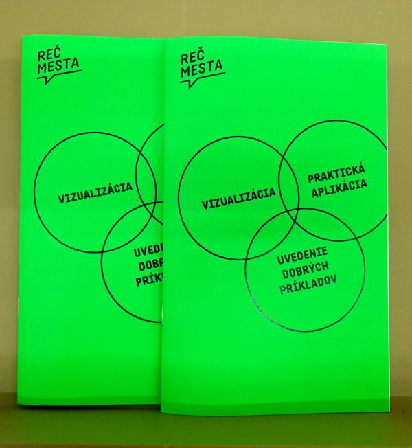
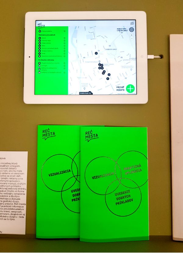
Project recmesta.sk (The Word of the City) offers a quick tool to help entrepreneurs and normal people see how typography, advertisement and street signs can really change visual culture of entire city. It also shows that unprofessional signs production can ruin the spirit of the streets.
Kristína Šebejová, one of the founder of this project is a graphic designer based in Prešov. She graduated design and visual communication at Technical University of Košice. Kristína is also a member of Association Wave, which brings architects, graphic designers and enthusiasts to closer collaboration. This is the place where more interesting project were born.
The main point of this project is to educate the public. It raises awareness about the rule of architecture - its form is to shapes the street into a bigger entirety. Authors of this project want to spread the fact that buildings, as a form of bigger art piece, is more than just a shell for money machinery. Indeed, buildings form our culture and visual attack can ruin their visuality.
Visual smog has been a critical topic in our country for a while now. The problem is, that discussion is formed mainly between people from the related profession. But did you ever wonder if normal human being was noticing how the street talks to him/her?
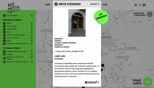
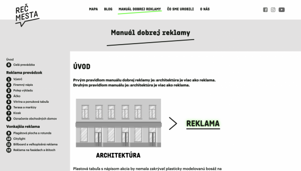
Reč mesta, roughly translated as “The word of the city”, feels responsibility, and stands for itself. I think it’s more brave to answer questions than just ask. Reč mesta is presenting a quick manual how to use advertisement with clean, logical and minimal look. The web also contains interactive map where you can see, and inspire yourself with a good examples of brand implementation.
From my point of view, at this time, the project feels a little sleepy and without any ongoing activity. It looks like it is just another website in the internet ocean. The project has its potential and should be more presented for the general public.
license: Attribution-ShareAlike
