Project Bill, please!
Designers can help municipalities to become more understandable
Transparent International Slovakia (TIS) every year creates a report about the transparency of each Slovak city. This report shows how the cities publish their budgets, agreements, and other documents about city management, in order to make it accessible to citizens and other people. Although some cities dutifully regularly publish all documents on their city website, there is a problem with the way these documents are presented, communicated and readability.
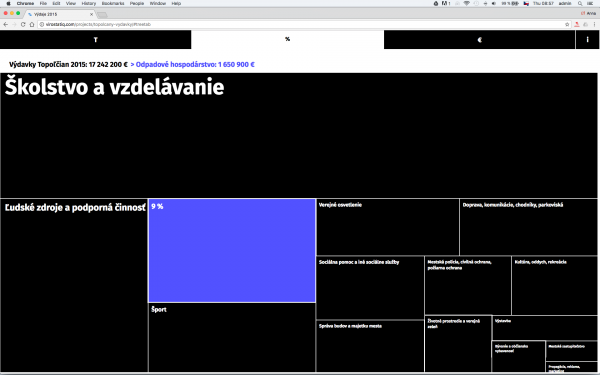
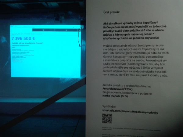
The focus of the project Bill, please! is how to visually interpret the city budget of Topoľčany and its data to increase citizen understanding. It uses data from the final budget of 2015. This document was originally presented as a long text file with a lot of information, tabs, and complex, unclear language. On the other hand, this document contains important and interesting information about management of the city, its sectors, and development in general. It is an important document for the work of municipality officers NGOs, and institutions or companies in the city.
But it is also important to citizens because their taxes fund the city budget and they have a right to know their money is being spent. For the cities, it should be of paramount importance to change their approach and communication of this information because it also clearly demonstrates that the municipality is managed well and working for the good of its citizens. I believe that communication design can play an essential role in this case.
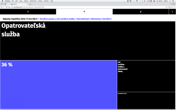
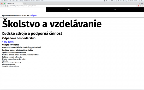
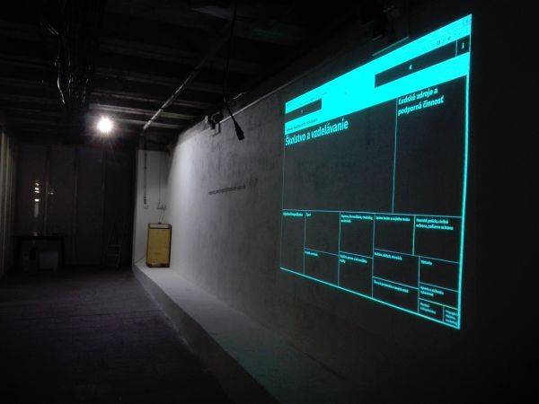
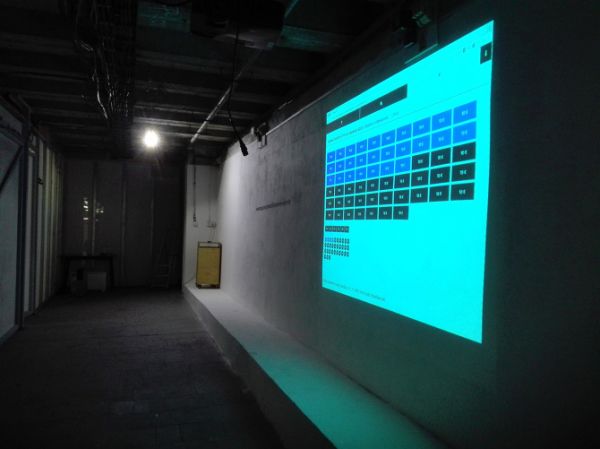
In Bill please!, I thought about how we, as designers, can help with the simplification of a budget as well how to show data to people in a new context. In collaboration with Slovenian web-programmer Marko Plahuta, we developed an interactive prototype of a website that works with basic budget items and their structuring. I designed three different visual contexts for how the structure could be shown: typographically; percentages; and cost per citizen. I wanted to make the complex data easier to understand. I also made a simply hierarchy of costs from the biggest to smallest, which also makes for faster orientation and can give a meaningful message to people.
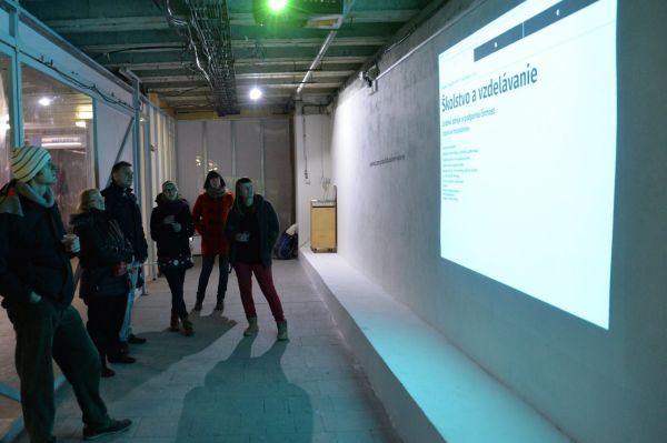
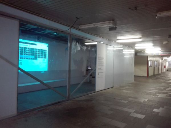
I presented the resulting prototype as a screening and installation in a public space – a gallery in railway underground Nástupište 1-12 in Topoľčany. Passersby could test and leave feedback on the project. It also opened the discussion and interest from municipality officers who came to the opening of exhibition. I also contacted the municipality after the event, but unfortunately I did not get any answer so we did not move to other cooperation.
Despite of its failure, in my opinion Slovak graphic designers should think about how to be more involved in municipal projects and search for possibilities for common communication with city managers. Because this system requires a change in thinking and working, it will take a lot of time and should be implemented in baby steps.
license: Attribution-NonCommercial-ShareAlike
