David wasn’t really wanting to become a graphic designer until the ripe old age of 26, when he met his instructor (later his good friend). In my opinion, education and studies are very important part of success and carrier however in the same time could mean the opposite. But that happens less.
Before I analyse his work I have to mention some of the basic rules of Bauhaus first and have to ask myself, what are the borders of a good design? To get some answers to that I have to compare his work with the minimalistic style of Bauhaus that determined all the cultural and artistic segments of the 20th century until nowadays.
Form follows function presented by Mies van der Rohe as “an honesty of the construction, death for the decoration” A big amount of David Carsons’ work is not understandable on the first look - the viewer can’t be sure if it is a poster, an ad or something else. If I can’t catch the function.
Bauhaus typography rules claim to concentrate on simplifying fonts and avoiding heavy renderings. Type should be arranged horizontally, vertically and even diagonally. It refuses to combine lower and upper case types in a same work.
On the other hand David Carson considers type as a picture - a totally cool object for rendering, blurring and a tool for decoration. He thinks that layers or structures of the deformed fonts are more important then their function - this is the way how the experimental typography is made. Significant for him is also placing simple geometry everywhere - inspired by cubist artists, such as Picasso and Gris. Clean, abstract etc.
Any further, Carsons' point is to push the viewer to an other way of thinking. Nowadays we do a lot of reading on screens - we are catching headlines, we are reading lot of moving images such as animated GIF's etc… Media is more and more pushing us to read different messages and ads.
Carson's “punk and revolutionary” approach is obviously based on switching us off from all these determined manipulations of mass-media systems.
However David Carsons' design doesn’t fit in the nowadays trends of minimalism, which influenced the 20 century, he won couple of awards and competitions. His name is well-known everywhere and for every graphic designer who likes experimental typography he will always be an enormous inspiration.
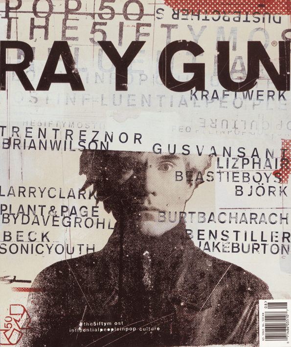
Ray Gun magazine
author: https://cdn-images-1.medium.com/max/1200/1*T7IRqiOqvoxWUuvEfJce8Q.jpeg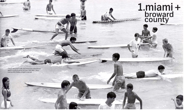
Magazine design by David Carson, Surfing Florida A photographic history
author: https://i.pinimg.com/564x/50/5a/ca/505acab5a91ba9a9ff5d23dece967274--david-carson-magazine-design.jpg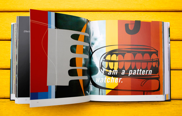
design by David Carson, The Book of Probes
author: https://www.brainpickings.org/wp-content/uploads/2012/02/bookofprobes13.jpg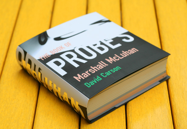
design by David Carson, The Book of Probes00
author: http://www.davidcarsondesign.com/t/clients/marshall-mcluhan/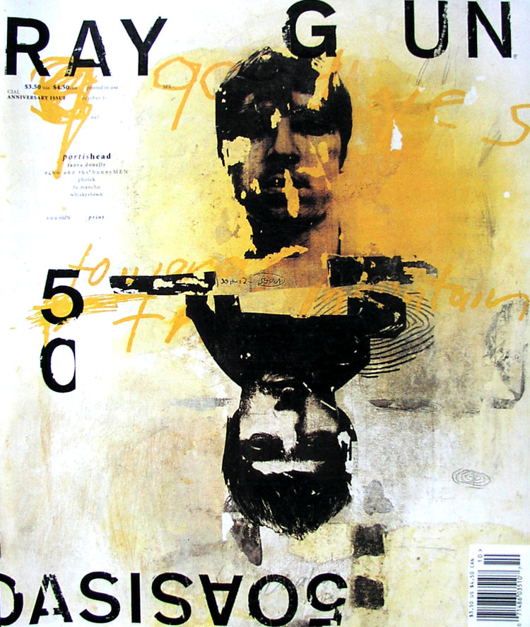
Ray Gun magazine01
author: https://i.pinimg.com/originals/8c/a4/46/8ca446b73adabea47cddda56d539a3d3.jpg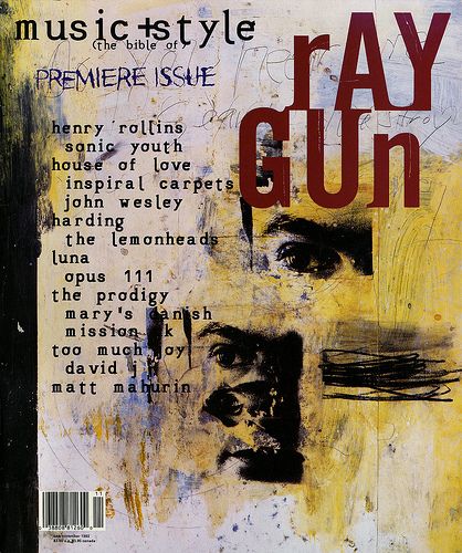
Ray Gun magazine02
author: https://www.designmantic.com/blog/wp-content/uploads/2017/11/David-Carson-1.jpg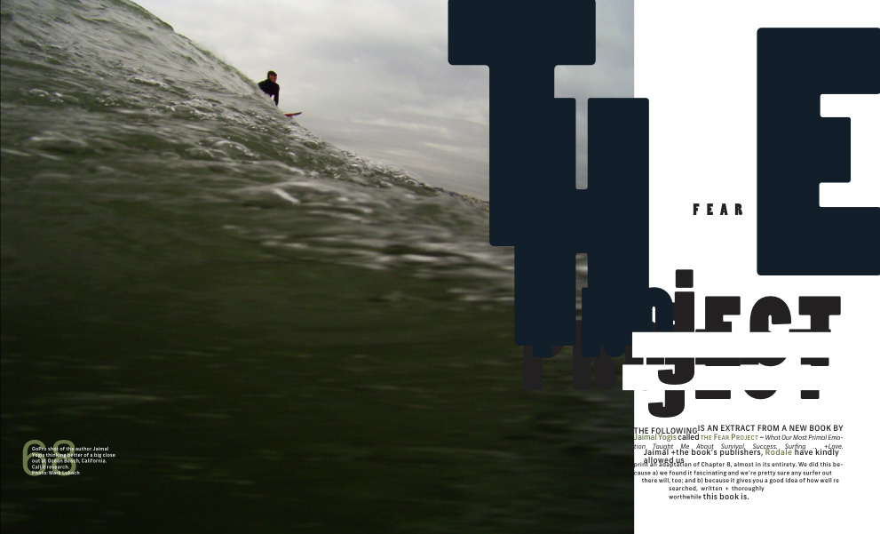
The Magazine Factory, London, 2013
author: https://nvtodorova.files.wordpress.com/2013/10/magazinefactory_5.jpg