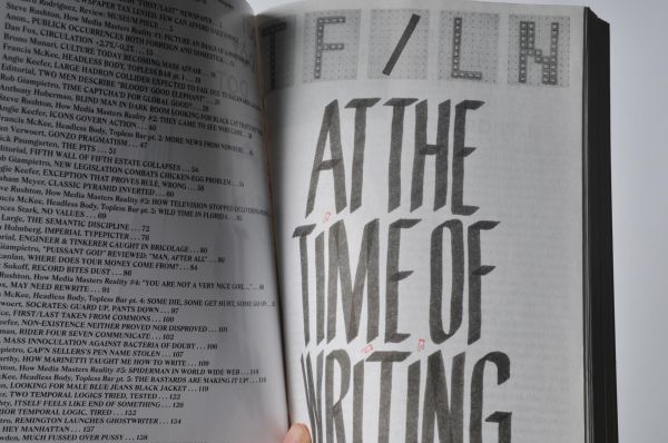
Project DOT DOT DOT, out of the ordinary
Think out of the ordinary
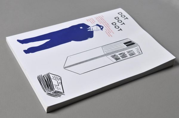
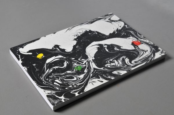
DOT DOT DOT is an independent magazine published by two designers Stuart Bailey and Peter Biľak Amsterdam-based designers.
This magazine is a specific art critical magazine which connect art from various departments from music to visual art. The difference compared to common design magazines, DOT DOT DOT match thematically unrelated things. They are also focused on overlooked aspects of culture - like Estonian composer, the cult British rock band, experimental novelists and the Polish women magazines all of these topics in one issue.
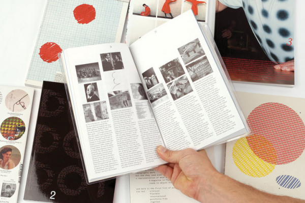
The magazine is varied in topic and also in concept of way how they worked with themes. What I found out is a theory about comparing. Imagine this theory on language word categorisation - synonyms, homonyms and opposites.
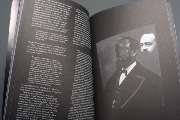
The magazine use those three forms of comparing also in design; synonyms - compare the same product in various ways of design, homonyms - different product with the same way of design - for example four various books from different designers connected by same colour and similar visuality and opposites - combine seemingly incompatible themes and also the form of layout seems serious but the content is many times sarcastic with dry humor.
I think that the extensively of topic is a significant of good magazine, especially when it’s a magazine about art, it could help to readers think out of the box.
license: Attribution-ShareAlike
