Project Honest package
Nutrition data first...
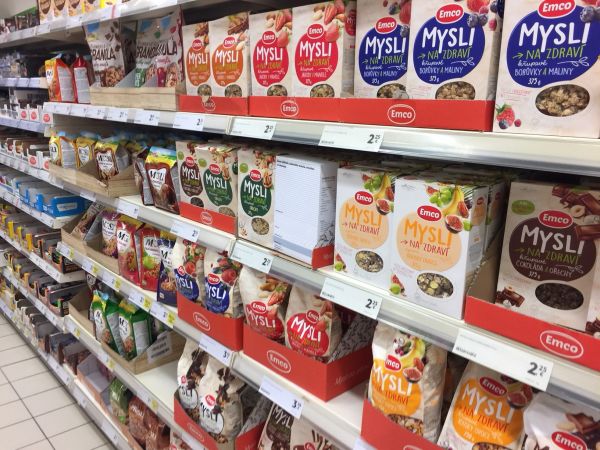
In my critical project, I was thinking about the visual information that surrounds us. Specifically, food packaging. Despite the fact that food plays an important role in our life, it is not fair how producers communicate via packaging with a customer. A huge product/brand logo with illustrations of food ingredients that are in some form in the final product. Often idealized and distorted.
Of course, the product's packaging is the first visual contact with the customer, and it has to attract consumer and differentiate itself from the competition. However, it is questionable that if packaging really should be created that way.
There is also another important thing that is not good for the consumer - the fact that the most important information, product ingredients, is on the back of the package and often it is hard to read because of font size. Similar with nutrition data.
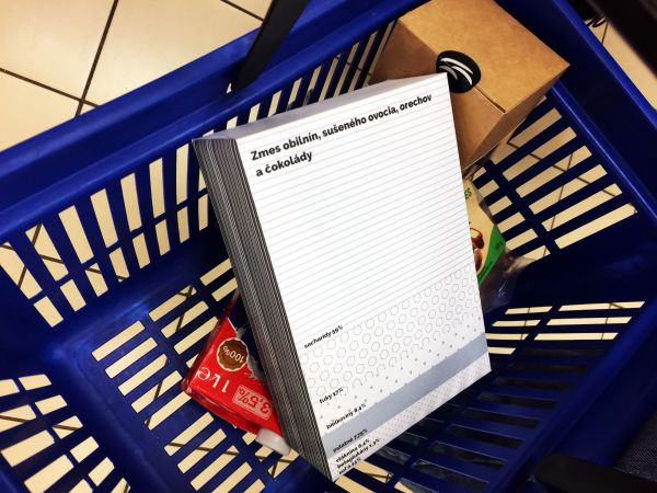
Therefore I have decided to create a package called AnHonest Package. I chose one product. Although cereals are a specific choice, they are still covered with myths about how they belong to a healthy diet, even though they contain large amounts of sugar. Package with minimalist design whose main purpose is to show information about composition and nutrition data.
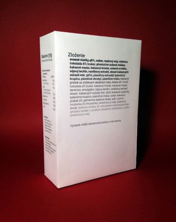
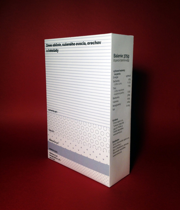
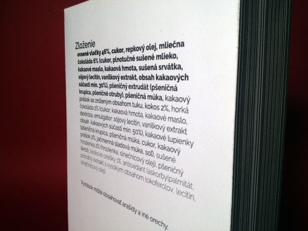
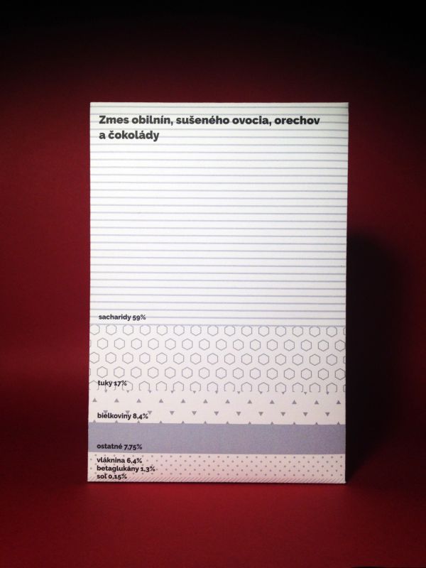
The entire front of the box is a graph divided by the percentage of nutrients (59% of the carbohydrate in the portion, 59% of the area on the package) plus a short description of the product. On the side there is an information about the weight plus the nutrition value per serving. On the back of the package is an information about the ingredients of the product. Typography of that text refers to the order of the ingredients, so I chose the different weight of font (from black to extra light).
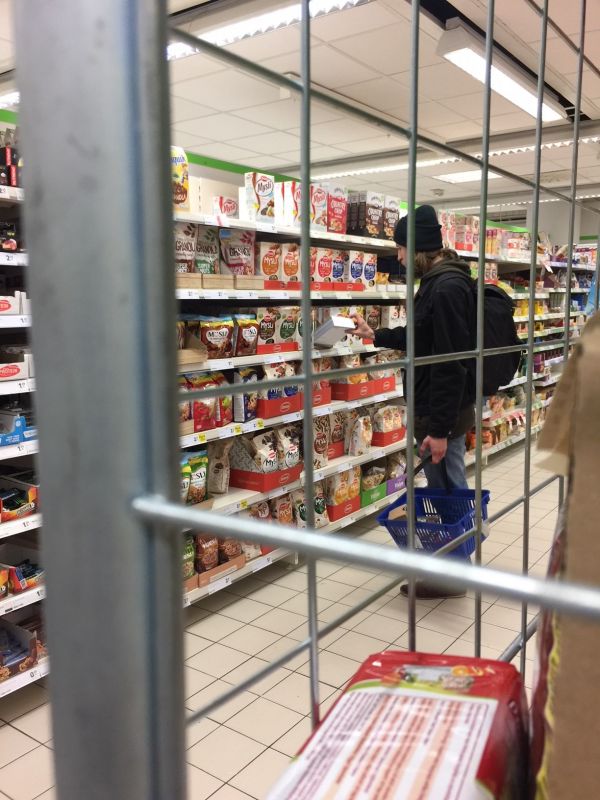
The product with honest packaging was later applied in the supermarket. I put it between the same products in the cereals aisle and waited. People noticed the different packaging but almost nobody took it into his hands. I tried different types of implementation, I placed it in a shopping basket and I left it in different places or tried to put the packaging in almost empty shelves as if someone had forgotten it.
In the cereals aisle one man stopped and took the Honest package but then he placed it back. When I asked him what is he thinking about the package. He said that it is interesting but people would have to spend a lot more time shopping. What I basically agree with, the honest package forces customers to find out what are they really buying and it takes time.
This project was created during the course Critic – Critical practice in Graphic Design at Department of Visual Communication at Academy of Fine Arts and Design in Bratislava. Tutored by Katarína Balážiková. The course foucuses on practicing and developing individual or collaborative critical projects.
license: Attribution
