As a 4th year student of Academy of Fine Arts and Design in Bratislava (AFAD), I have come across my school’s website quite a few times. Whether I was checking for important announcements or catching up with the newest articles, I always liked the site’s easy navigation and clean design. The piece of information I look for the most often are the business hours of the study office because for some reason the timetable has never stuck in my head and I found it very convenient to always look and make sure they are open when I need to visit.
The problem is that the AFAD site doesn’t have a mobile version to this day. To say the least, it makes looking for information via smartphone a pretty unpleasant experience. The website design is not responsive, which means that when opening the site through mobile all the elements on the page stack themselves randomly on top of each other, making it very difficult to make sense of them. Needless to say, this defeats the purpose of all of the information stated there because most of the content is unreadable.
When it comes to the particular Study Office section, there is really no way to figure out which times they are open. You need to switch to desktop version on your smartphone or open the site once again on a desktop.
I was talking about this subject with some of my schoolmates and everyone agreed that there should be an easy solution to that. I wasn’t the only one that kept visiting the school’s website primarily for checking the business hours. Nowadays the internet is being used mainly on devices such as tablets and smartphones and it is a must for designers and institutions to get accustomed to that trend.
My simple solution was to create a wordpress site with a single entry – I pasted the business hours there along with an address of the AFAD building. I posted my new site’s address to our AFAD Facebok group with a little message saying: "If you’ve ever been annoyed that you cannot check the opening hours of our study office because after the website loads every single line is overlapping, you can visit the page below."
The post received some likes and feedback (in my personal inbox). I got some messages containing only smiling/laughing emojis and two messages that said it is a nice idea to create a plain website like this, even if it’s only for the sake of pointing out the lack of AFAD website’s responsiveness.
This project could be developed a bit further, especially when it comes down to actually speaking with competent people. However, it was an early and straightforward action that could potentially help at least a couple of people while pointing out the ineffective design solution of my school’s website.
This project was created during the course Critic – Critical practice in Graphic Design at Department of Visual Communication at Academy of Fine Arts and Design in Bratislava. Tutored by Katarína Balážiková. The course foucuses on practicing and developing individual or collaborative critical projects.

My post to Academy of Fine Arts and Design students' Facebook group
author: Daniela Brunovská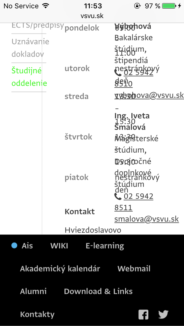
Mobile version of AFAD's website, section of Study Office
author: Daniela Brunovská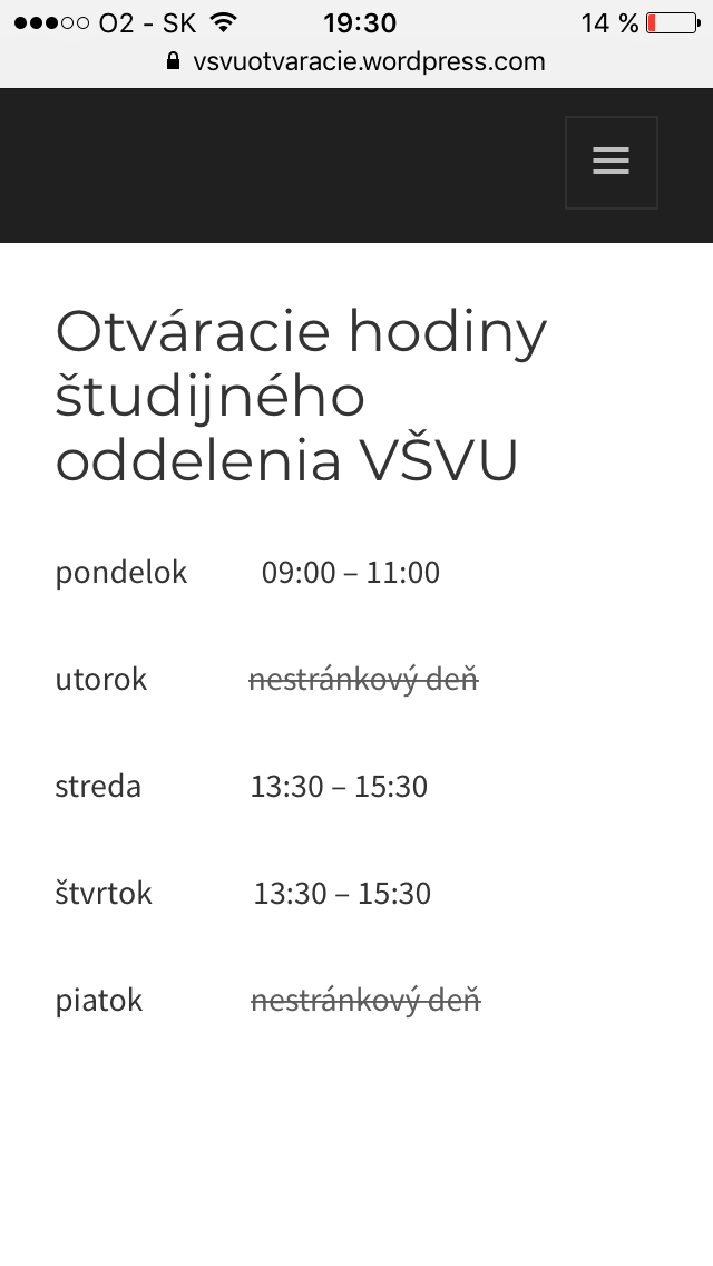
My webpage with copy-pasted office hours of Study Office, designed to be viewed on mobile
author: Daniela Brunovská